
Monday, November 25, 2013
Adv Web - 25 - Fluid in CIS?
Thursday, November 21, 2013
Adv Web - 24 - I still don't understand this design

I don't understand this design style where you scroll down through the different divs each containing different information. It's something that I critiqued about the Microsoft because it takes forever to get down to the footer and there's no real end in sight. If there were a static footer and then the center area scrolled that would probably look and feel better or have those headers and footers that scroll with the page but this makes the page way too large.
Adv Web - 23 - More elements changing

This is becoming less about the fluid design where the divs are percentages but instead they're about how these elements can change with a simple click. There was an image in the center of this page and upon clicking a "try this" button it turns into a video player. This is really good if you want a website to be one page without having to scroll and then things can change as you need them to by clicking elements.
Adv Web - 22 - The stuff changes


This website has the header change when the website gets smaller. I didn't know that you could change the look of the header when the website size changes. it went from looking like a desktop website to more of a mobile version with a smaller window because of elements changing.
Adv Web - 21 - Issue scaling in fluid site


This is a pretty cool website that uses horizontal scrolling for a timeline effect. It has a bit of a large loading time and they have their own loading icon which is kind of a bad thing but they're also covering 100 years of technology. My only quarrel with this site is that the timeline stuff does not resize with the window of the web browser.

I didn't shrink it down too much before the pictures were going out of my line of site and the social network icons were squished out of proportion. It's unfortunate because this site has a lot of potential but there is still quite a bit of tweaking that needs to be done.
Adv Web - 20 - Another Fluid Design

The last one was actually the contest page which was designed to be fluid as well but this site is the direct real deal. It's interesting to see all of the different elements The image at the top swipes off the the side changing every now and then.

It's interesting to see how the header stuff acts because of everything being a percentage of the overall site. The image at the top goes to the edges so I'm wondering if the wrapper is 100% and then the body is a smaller percentage. The navigation and logo in the header get a bit squished when downsizing but this is meant more for different resolutions not for you to play around in the browser squishing the window in stupid ways.
Adv Web - 19 - Responsive Site


I found a site that did some sort of competition for fluid website design and I have to say that the effect of responsive website design is kind of wonky. Here you can see the site in two seemingly natural states that work well and fit the browser. It might be something that I'm not used to because responsive design isn't applied much because most of the website creators are doing it from more of a programming standard than a design standard but it still feels a bit strange to me.
Adv Web - 18 - Mobile vs App


Mobile websites are becoming increasingly important but many are turning towards having app versions of their products and the differences are pretty noticeable. On the App version on the right the information looks a lot cleaner without having the dark bars everywhere separating information, yet on the left the videos on youtube are displayed in a more functional manner that would be more beneficial in the app where there is more space.
Apps also don't have to rely on the mobile web browser which can be a pro or con depending on the company which is producing the app. There are also features in the apps that can't be achieved in a web browser like the Youtube App's picture in picture function that allows you to watch a video while scrolling through to find the next one.
So even with mobile websites being important by the time they made their way into the curriculum there is already more ways to handle this mobile web browsing need than we have even touched.
Wednesday, November 20, 2013
Digital Video - 36 - Jogwheel original
This is a real quick original short but the opening shots and atmosphere are good. It does overplay a bit when it comes to the intense music as Jon runs to the window but overall it's a funny video that shows off his knowledge of producing a quality video even if it's a short one.
Digital Video - 35 - Recording Instruments
I have first hand experienced how hard it can be to effectively record musical instruments because either they're too loud or quiet, and can easily drown other things out like vocals. Laura does a nice job here, it's a bit low yet I can still hear it fine with the volume up a little louder.
Digital Video - 34 - 3D animation and video production
http://www.youtube.com/watch?v=UTqnhMYOOmQ
unpublished video you have to click the link for this one.
There are some nice video techniques in this video even though it's animated. The shot starts off at a low angle and then cranes up showing Chell sitting on the companion cube. Then the camera and eye being led by the bird breaking away from the rising shot really pulls you in the direction that it is moving. It's unfortunate that the video is so short, but it effectively does what it has to even with how short it is.
Digital Video - 33 - Syncing audio and video
So something we've been talking about during the storyboard critique for the music video is to have things sync up to the music. The biggest example in my head is this video because they cut clips to the music and synchronized them perfectly. So with the repetitive action that fits the catchy tune this is guaranteed to get stuck in your head.
Digital Video - 32 - Outtakes
Even if you're doing an outtake video you have to put thought into the editing of the clips together so they feel coherent and that you're not just watching a lot of screw ups. John and Hank use good cuts here cutting out the beginning of the shots to jump right into the action and keep the funny outtakes and reactions rolling.
Digital Video - 31 - Chill
I like this video not only for the awesome cover of this classic gaming tune but it also has some great transitions as instruments become more prominent or completely disappear. This is something that is pretty common when it comes to covers of songs, but it shows fitting multiple camera shots onto one screen very well.
Digital Video - 30 - Audio Preset

Digital Video - 29 - Audio Levels
This video is notorious for the "Swiss fucking cheese god damn it" part but something that most people don't notices is how well the editors of the video watched the levels. Micheal's voice never clips or gets too loud that you feel the need to crank down your volume because it makes your ears want to bleed. Watching your audio levels are really important when you're overlaying multiple tracks, and becomes even more important when someone is screaming or changing volumes constantly.
Sunday, November 17, 2013
Digital Video -28 - Thriller
It has been quite awhile since I've watched Thriller and seeing the beginning again I was like "wow I forgot how cheesy this was" just to have it thrown in my face that the first four minutes of the video is a movie that the characters that star in the music video are watching. The choreography is amazing and is still iconic in our culture. If someone I knew could pull off the entire dance from the climax of this song perfectly I'd have to throw them a $20. After getting over the cheesy feeling of the video Michael and his date are watching the feeling of short story mixed with music video gets incredibly strong and just knocks you out. 10/10 would watch again.
Digital Video - 27 - Music Video
This is a great song but the video makes no sense. Like it looks great an all but I cannot see much rhyme or reason at all it just feels like they told the actors to go out into that vacant area and stage a fight. What's even more crazy about this is that this is the song that I want to do for project four and just wow.
Digital Video - 26 - Memorable Moments 2
This is a newer instance of Memorable Moments that I only want to bring up because the graphics have been updated by this version by their friend Dan who majored in motion graphics at SCAD. The new graphics actually follow the bran identity of the channel which is weird to think about but even when you're a video producer there's a kind of brand or common elements that work their way into every aspect of your videos. There are even some producers that slip things into every single one of their videos as a kind of trade mark. Anyway new graphic and off topic thoughts aside the new graphics area nice little touch that makes things look more unified.
Digital Video - 25 - Memorable Moments
As part of Stephenplays Stephen does a little segment called Memorable Moments that hilight clips from his LP series. More focus is put into the introduction and ending of each segment as a preexisting clip already exists. I'll probably come back to this concept in motion graphics because there are a lot of custom graphics that are animated and make things more interesting.
Adv. Web - 17 - CSCC mobile

I have to give CSCC some credit for actually making a mobile version of their websites, but at the same time it needs quite a bit of work .That banner needs to change I know that i'ts present in the main website but even there it looks wierd and out of place. These navigation links could just be in their own subcategory in the menus below instead of sitting on the top looking completely broken. I do like the menus in the body that link off to the other pages. It's kind of empty but it's very clean. Maybe if a picture was substituted into the area where the broken nav and banner are then the site will feel a lot more complete.
Adv. Web -16 - Coumbus State Community College

Columbus state has a much better layout on their blackboard site but their main site is a bit of a mess. I'm immediately thrown off by the banner above the header. For some reason it really throws the hierarchy out hte window for me and makes the name of the school and the navigation tools for the students seem way less important than they really are. The color scheme is enjoyable but there are so many different colors thrown in; the green, red, and orange make things feel disjointed and there's a bit of space between everything that gives breathing room but at the same times gives this feeling of disjointed unity. It makes me appreciate our weird looking website a bit more but it's worrisome that college websites are this out of date. Luckily a lot of them have been revamping recently.
Monday, November 4, 2013
Digital Video -24- Stephenplays
Another project that Stephen and his wife Mallory do is his let's playing channel Stephenplays. It's much newer than the vlog and the video quality hasn't dramatically increased because he has a pretty good set up from the start using component cables to capture the video with black magic intensity card.
He's not as information intense with his LPs in comparison to say Chuggaaconroy in fact there has been a lot more collaboration and when there aren't collabs and competitions it's focuses on getting over the trails of games that can be really difficult at times. There's also a huge focus on making the audio clear and the commentary useful to those who want to play the game or just entertaining.
Stephenplays is kind of the middle man between the other LPers that I've talked about like Chuggaaconroy and Raocow but he still makes interesting videos that I find myself watching when I have time.
Digital Video - 23 - Stephenvlog
Stephen Georg started his daily vlog his junior year of college and has been going strong for nearly 1500 days (4+ years). Stephen was one of the first vloggers who was more about taking the camera with him instead of sitting in front of a computer talking about happened that day. This is one of the more recent vlogs so he has the nice camera and knows a lot about how to deal with vlogging his daily life. He's visiting LPer Chuggaaconroy in this one.
Stephen is very good about trimming the fat out of the vlogs when they're doing a full day of interesting things. In the early vlog there were a lot of jump cuts in the same location and shot and everything was a mess. Then there's the quality of the video itself which improved immensely once he got used to using the Canon camera instead of the Flip which had a really small field of view. This kind of ended up being more about hte evolution of the vlog but it's crazy to not only see someone's life evolve over time but his skill level increasing since his days at SCAD.
Digital Video -22- Something a bit more random
Thursday, October 31, 2013
Advanced Web - 15 - Carroll's website doesn't work for web.

Oh man that is the tiniest navigation that I've ever seen. I'm surprised that a school that promotes mobile tools like alerts for campus closing and stuff doesn't have a website that works well with the web. It just barely works in landscape mode too. Hopefully this is something that they think of in the site revamp.
Advanced Web - 14 - Tumblr Mobile

Here's the mobiel Tumblr page for a fan blog that I run. The content fits nicely to the width of the of the screen and it's easily readable from here. It's interesting that the mobile version of the page works better than the Tumblr app which I still have to rant about because it's the worst app that I've ever had on my phone. It is a bit annoying to have to scroll to the bottom o the page to log out. I'd like to see the menus like on the app where you can swipe sideways and get a menu to come up instead of having to scroll, and scroll, and scroll, and then miss the button when the next page of content loads.
Advanced Web -13 - Mobile Yahoo

I usually think that Yahoo's stie looks like complete garbage but the mobile version looks pretty good. It does look like one of the older versions of Yahoo which is kind of common I notice that unlike our project which doesn't even think about scrolling down the page most mobile pages take advantage of that and it's sometimes necessary when your site is very content heavy.
Advanced Web - 12 - Apple for Mobile

It turns out that Apple doesn't really have a mobile version of their website but instead the website uses fluid first or something to resize to they dimension of the phone screen. It's a bit difficult to click the navigation buttons but everything still looks clean and transfers over to the phone well. It especially hi lights the center area where the product is changed.
Thursday, October 24, 2013
Advanced Web - 11 - What the actual fuck Google?

I guess google's main site is simplistic enough that you can visit it from a phone and not have a problem but when I go to m.google.com this is what coems up. Not a mobile version of a website but a website promoting the google apps for iOS and Android that actually looks better than the actual Google website. I have no idea if they're just so proud of their roots that they're afraid to go this direction for the main site but I like this a lot better, although the simplicity is what Google is liked for. It's where you choose what kind of search you want to do and then type in a word and get those results. You're not being barraged by information like "news" "weather" or stuff you'll never use *cough*Yahoo*cough*. This is just some little weird page on the internet that I was surprised to come across.
Digital Video - 21 - How many countries are there?
I've already commentated on CGP Grey's videos but this is one of the most well animated ones with a lot of content that stress how ambiguous the answer to the hypothetical question that is stated at the beginning of the video is.
There are even really good cut aways like his stick figure self rubbing his eyes in frustration to one of the topics that he has to cover to make the video more complete.
Tuesday, October 15, 2013
Advanced Web - 10 - Mobile Twitter

It's becoming really apparent that the mobiel versions of the website always draw from the style that the website had when it was first created. I don't see as much of these ugly yellows mixed with the bright cyan as much in the current design. Every time I see a mobile version of a website I end up thinking "wow this looks like it came from 2009"
Something I'll have to think about when creating my mobile site is to keep it looking streamline and modern instead of pushing the oldest form of the site into a mobile resolution.
Advanced Web - 9 - Mobile Facebook

Mobile sites do stay true to their originals while still simplifying. It's importnat to see the branding elements like the facebook blue and the fonts. There are also little elements taken from the original log in screen on the site.
Monday, October 7, 2013
Digital Video - 20 -Khan Academy
Digital Video - 19 - Wrong software for the job
I want to take a moment to talk about different type of video editing software because while going through my subscriptions on Youtube I came across one of the LPers that i used to follow every update but have slowly backed away as their content no longer matched my interests.
Something I do remember about his though i that all of his LPs so far were edited in Windows Movie Maker which I didn't even know was possible because it lacks common tools like a razor tool or multiple tracks to get in depth with. Somehow he managed to end the clips at the times he needed to and make the cuts to a different shot.
I think we kind of take for granted what we can do with the tools were given but we also need to learn to use the tools very effectively because if not then we might as well be using Windows Movie Maker or iMovie
Digital Video - 18 - A fly on the wall in Cupertino
Digital Video - 17 - Tribe Twelve
Digital Video - 16 - Marble Hornets
Adv Web - 8 - Personal Website
So this time I'm not going to link to a website but instead I want to talk about why I don't have many websites to link to at this point. Later on I'll be able to find more but for now I've come to realize just how many personal and professional websites are lessened by the reliance on social media sites. I also see a ton of people adding a custom domain name on top of Tumblr to make their blog more like a personal website (whether they actually purchase a domain or just slap a free on like a co.vu on top of it.)
I've already run into two tumblr blogs that have a co.vu domain name thrown on top of them for free which is nice but I feel that this capability is causing people to think less about creating their own websites to their needs and instead focusing on other options.
Now Tumblr can support custom HTML so in theory you could us it as a platform to make your own cool website with a custom domain name but I can see this being problematic especially when it comes to lazier and cheaper people.
Digital Video - 15 - Animation with 3D modeling
Digital Video - 14 - Animation
Digital Video - 13 - Toby Turner one take lazy vlolgs
Digital Video - 12 - CGP Grey Leap Year
Friday, October 4, 2013
Digital Video - 11 - Common mistake
An AARP commercial came on tv just a moment ago and the way the cuts were made I realized how nice it was how the shots flowed into each other and no single one lasted more than a few seconds long enough to recognize what was going on but not too long as to grow bored with it. The mistake of making a shot last too long is something that I've seen video production students make over and over again. It really puts things in perspective when you sit down and just pay attention to those annoying commercials that come up to interrupt whatever you're watching.
Adv Web - 7 - MalloryWeir.com

Adv Web. - 6 - Stephenge.org

Alternatively Stephengeorg.com. Stephen is a vlogger and Lp'er that lives in Myrtle Beach (Longs) South Carolina with his wife Mallory. He recently revamped the website he made his senior year at Savannah College of Art and Design to act as a sort of home page for all of his projects and link to all of the other social network links. It was interesting because I was able to tell off the bat that this website was made in Dreamweaver because of the clean style of the layout and the size of the site itself; it's about 955 wide and somewhere around 800 tall. The top left links to the vlog channel and the right links to the let's play channels.
Wednesday, October 2, 2013
Digital Video - 10 - The Fox
Something about this video is reminiscent of Thriller for the ridiculous group dance scenes. There are a lot of good shots though in the forest during the second verse that have really strong cool colors and makes you feel like it's the middle of the night in the woods. The directors and editors obviously knew what they were doing even though the song itself is ridiculous.
Saturday, September 28, 2013
Adv Web - 5 - Bahaviors in Dreamweaver
I'm going to try this when I can get back into the lab. I'm also going to check to see how many tutorials he has to expand my knowledge of Dreamweaver.
Adv Web - 4 - Apple interactive elements

Apple has been using a lot more of these changing elements in the center of their website that will lead you to more information on the product displayed there for a period of a few seconds. The inspection of the elements says that this is called a swap gallery and it's something that I have liked seeing on the internet for awhile but I was never sure about what it was. The navigation at the top of the screen also takes on the background color depending on this switch so somehow this is changing the very bottom most layer while the rest of the elements sit on top of it. I really want to find out more about this because it really shows something interesting in the styling of a website.
Wednesday, September 25, 2013
Digital Video - 9 - I only worked the audio here
This is my friend Kelsie's final from our time at the Carroll County Career and Technology Center. She worked a long time on this animation and my part was to help out during the animation phase but also I was put in charge of finding music to fit the video.
The music was Kevin Macleod and it took a lot of time and consideration to find music that fit the video well We actually went through quite a few songs but the ones that I presented after spending a few hours searching through music we decided on these and I synced them up to the video adding in the fads and transitions between songs with similar parts to them.
Digital Video - 8 - Educational Youtube
Digital Video - 7 - Editing of multiple screen gaming
You can see in his let's play of Kid Icarus uprising that he has to deal with the issue of there being information on the bottom screen which he solves by making it smaller in the left hand corner. He did something similar in his Okamiden Let's play where the screens switched based on what was happening but the bottom screen map was always shown in the right corner of the video player area.
Digital Video - 6 - Dan Brown does no jump cut
Digital Video - 5 - Jump Cut
What's interesting is that we usually think of jump cuts as bad continuity but Dan breaks that rule here and uses them as a stylistic choice and to give him time between pieces to think of what the next part of the video will be.
Digital Video - 4 - Editing of commentary
http://www.youtube.com/watch?v=0h25UNmYc8U&t=16m57s
One of my favorite Youtubers is Raocow because of his off the wall commentary which is in contrast to lpers like Chuggaaconroy who have to know and relay every interesting details about a series. Raocow occasionally speeds up or "chipmunks" them. He even <trope>Lampshades</trope> the fact that this segment is going to be chipmunked.
The decision behind this is tht there is no new content but the segment too short for there to be a cut and would look weird because this run shows the completion of the level. It's an interesting little piece of his style that has been showing for the entire run of his lping career.
Adv Web - 3 - Meeting to redesign Carroll's website
Yesterday we attended the meeting with the marketing team regarding the redesign of Carroll's website.
It was a very relaxed meeting probably so because they knew that they were dealing with students but by the end we had proved that we have professional opinions that matter. It was very interesting that by the end of the meeting we were actually critiquing the original website on the projector.
I took a few notes on the contents of the meeting. But may students that weren't part of our design class spoke on the lack of branding with the other information that we sent out about our school.
Overall I feel that the meeting was successful and I was interesting in attending more meetings about this important point in Carroll's history.
Saturday, September 14, 2013
Adv Web - 2 - Crash Course

This goes to show that not only can animated logos be interesting but they can be tweaked and customized to meet the different needs of different parts of an overall brand. Now the downside to this is that you could risk changing a logo in the naimated to the point where it becomes too unique to be tied back to the original, but you have the opportunity to create these sub brands and an overall stronger product image.
Digital Video - 3 - You have to learn from your past 2: Electric Boogaloo.
This one is even older than the last one.
Pros
The title at the beginning was okay, good recovery from unseen complications like the missing folder scene, good music choice.
Cons
Lighting (okay we weren't allowed to use lighting equipment but still), scenes dragged on way too long, no cut away to show how close to 8:15 we were, camara shakes at ends of certain shots no padding was given, continuity sucks.
I can't say much because this was my first real edited video but it's still pretty bad.
Digital Video - 2 - You have to learn from your past
So as one of the few people in this class that has had video classes and experience it's obvious that I have a few pieces that aren't that great.
Pros
The segment with Hooper on the computer and phone was pretty well done, and the audio of Ryan was put in the background to add continuity. The improved line "this is the third time this week was also good. The cutaway to Ryan on the floor between Hooper shots was also nice.
Cons
Lack of variety in shots, no real use of lighting besides the first shot, focus on the product was lost after the first 12 seconds, there was a clear parody here of GEICO "can 15 minutes really save you 15%:" and that's okay but the joke was too drawn out, voice over audio and the first shot echo too much due to room size probably used a shotgun mic instead of pinning one to my shirt.
Digital Video - 1- Outtakes
This may look like I'm just dicking around on YouTube but outtakes are an important part of the production phase. It's inevitable that you're eventually going to screw up and it's okay. This is something that I've had to learn first hand in my video production courses. Even a simple four minute video can have something like half an hour of footage and stuff that just isn't good enough to make the final cut. The production phase takes a lot of time and proper planning should be completed beforehand in pre-production so that recovery from mistakes can be as quick as possible.
Saturday, September 7, 2013
Adv. Web - 1 - Where do we see animated logos?
When you think about an animated logo you can almost think of many that you've seen in your life time but where are these seen? A majority of the animated logos that you see aren't actually done directly on web applications but more as part of a larger video or flash project as kind of an introduction.
The Pixar logo is a really well known but overlooked animated logo. It's simple, gets the job done, but it's mostly seen at the start of one of their films but not on their own website where only the original word is displayed. Animated gifs have been available since the late 80s and Macromedia Flash (now Adobe Flash) was formally released in 1996. So where exactly are animated logos if the capability has been around for decades?
Thursday, May 9, 2013
web -37- Spargos

Everything is really clean, I would have liked to see a small version of the social network links in between the information in the footer. The purple also doesn't feel right for the atmosphere of the restaurant and the colors that they use on all of the menus and other items.
Other than that it's really nice.
web -36- Android

The green of their logo goes really well with the other bright colors, and the site itself is really clean. Android's site is actually one of the few sites that doesnt' look ridiculously blank.
web -35- Comcast II

This website is a little bit better than the Xfinity website actually showing more about the services that Comcast provides. The line that used to divide the two distint sites has been blurred in the recent years. Xfinity used to be the website that you would go to as a subscriber to comcast's services and get an inside look for being a member of their circle; Comcast the website used to be for new people to come in and check out the rates and different services they could get. These still somewhat remain true but they're not as concrete as they used to be years ago. The layout is still a bit atrocious there's no real hierarchy and things are just slapped into places.
web -34- Comcast I

The entire thing once again has the look of a news site which is somewhat approprite for the site that stars phone, internet, and tv services. But honestly what do these ridiculous news stories have to do with the services that I'm paying you for? The only way I know this is even a website for a huge service provider that runs a monopoly over the east coast of the united states is the fact that there's a tiny side bar with links to some of their services on the left side.
Web -33- Verizon II (Wireless & Business)

Web -32- Verizon

web -31- Chrome

web -30- Mozilla

Web -29- Australia Parliament

The area at the very bottom gets a little link heavy in the footer but that seems to be something that is unavoidable at least in the eyes of government sites.
Web -29- United Kingdom Parliament

You're probably wondering why there is so much grey to the right of the cap. Well the site is left aligned which makes reading it on a wider screen really awkward.
Web -28- The worst website

This website looks like absolute shit. The amazing part is it appears to have been made in Dreamweaver because of the style and layout of things but the colors and other asthetics make my eyes want to bleed. not to mention that every time you try to select text to paste it into microsoft word it also copys a black hilight instead of the text just being white on a black background. No that would be too simple instead the stext is white, on a black background, also hilighted in black.
Tuesday, April 9, 2013
Web -27- Canada

Web -26- Whitehouse

Web -25- Access Washington

Web -24- MVHS

Web -23- DC

Web -22- CCPS

Tuesday, April 2, 2013
Web -21- Websites over time
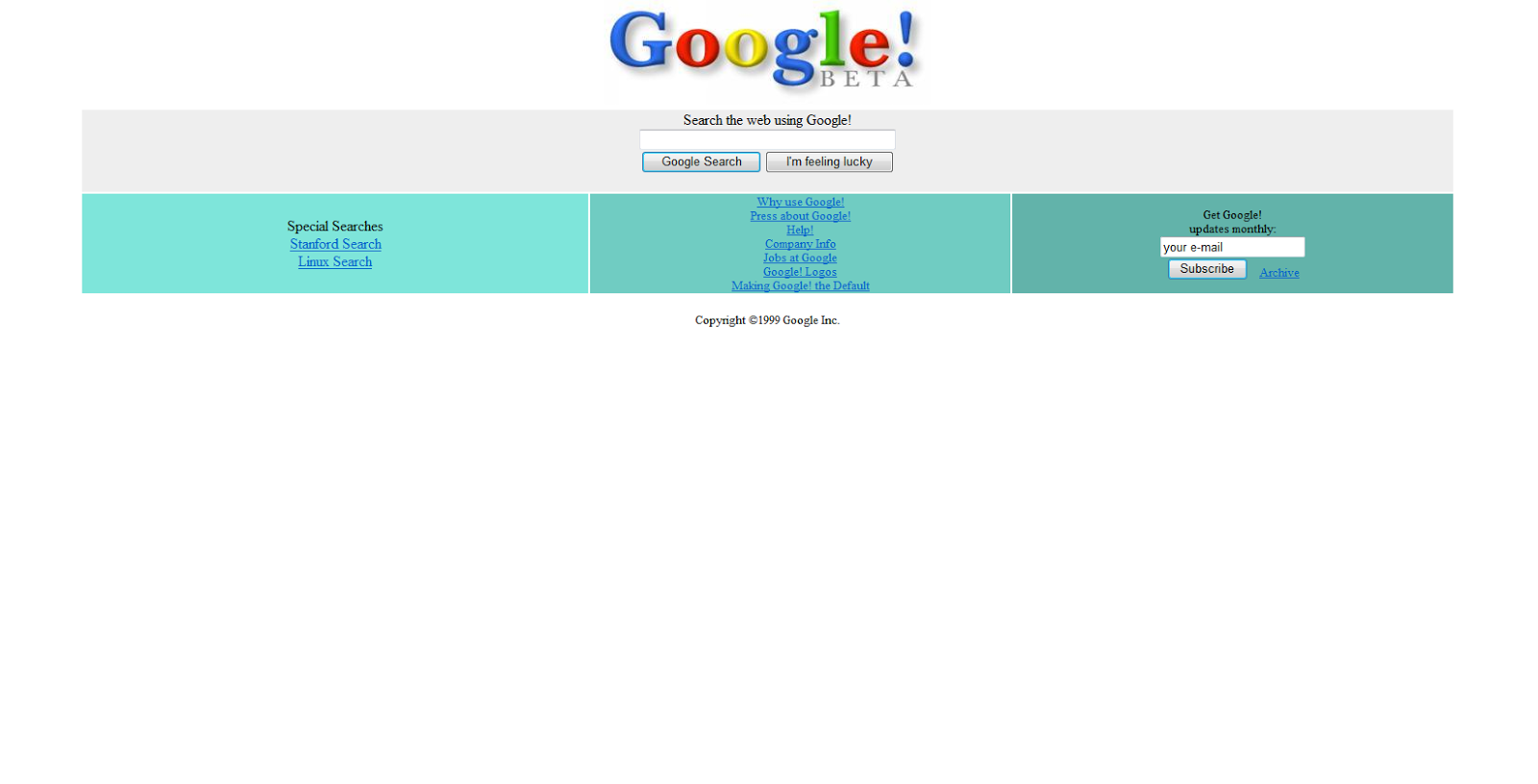
No Google didn't change the layout again they save that crap for Youtube. This is Google Beta as it appeared in the mid 90's when the site was just starting out. I want to bring this up because as we pick and critique what works and does not for sites the idea of something looking old or dated always comes up. Well what was the trend way back when websites were just getting their start? Google Beta clearly shows what websites were all about back in the day, there wasn't a lot of information and design was all about just using different colors and different colors to keep things distinguishable.

Sunday, March 17, 2013
Web -20- Maryland.gov

This is what you're greeted with when you enter the website for the state of Maryland. I had to zoom out to 75% just to comfortably browse the site. Everything looks like a jumbled mess and I'm not sure why because I don't remember it being like this the last time I looked at the page. The navigation is under a huge content block that doesn't warrant it's own space like that or at least not a space that large. If the picture was a bit thinner and didn't stretch across the entire page it would be more of a focal point rather than making it look like the page broke, and trust me I refreshed to make sure this wasn't some horrible browser error.
I really like the opaque header which is why I thought this was going to be a nice one to do, but the rest of the website is mangled. Do the rest of the content background as a solid color, bring in a bit more white and yellow to tie into the colors of the Maryland flag and for the love of all internet users make your website size appropriate for those who don't suffer from vision impairment.
Subscribe to:
Comments (Atom)