Thursday, November 29, 2012

Design -74- Wacom

The box art here is really exciting. The product is displayed proudly and the orange causes everything to pop. The images are at the bottom giving weight to the bottom of the box. I also really like how the name of the tablet is written on top of the picture of the tablet. There's a bit too much at the bottom, but it's just a bit overdone.

Tuesday, November 27, 2012

Typography -67- Skills

The heirarchy is good, the stuff on the left in the white is the areas that are tested. It could be a bit bolder but hey that's nothing that's worth complaining about too much. The only real problem I have is that there are a lot of different fonts used. I recently learned that you should stick to around three fonts for each piece and I'm pretty sure that this one uses a bit more than that. This isn't even including the different fonts in the logos of each group, but maybe seeing those are tricking my eye.

Design -73- Graphics Certificate

this is one of my three certificates from my print production program hanging up on my wall. I just realized that there's some interesting thing about the way the certificate is designed itself. The majority of the thing is red white and blue which goes hand in hand will the name SkillsUSA. There's this weird empty spot above the red line which has been bothering me a lot lately. There isn't much flow with the information in the white area under the red line either.

Typography -66(6)- What the hell type

There's this thing when you're designing when you have to realize that there is too much type in a piece, but it just goes on and on. I can't even be bothered to read the body copy of this piece because there is just so much information. Seriously what the hell was the person who designed this thinking? I guess they're trying to appeal to those who they can scam money from or an audience that doesn't actually get design. This is why I don't care for art schools, things just like this.

Now for your lack of enjoyment I'm going to copy and paste the same block of text over and over again to illustrate my point through example.

There's this thing when you're designing when you have to realize that there is too much type in a piece, but it just goes on and on. I can't even be bothered to read the body copy of this piece because there is just so much information. Seriously what the hell was the person who designed this thinking? I guess they're trying to appeal to those who they can scam money from or an audience that doesn't actually get design. This is why I don't care for art schools, things just like this.There's this thing when you're designing when you have to realize that there is too much type in a piece, but it just goes on and on. I can't even be bothered to read the body copy of this piece because there is just so much information. Seriously what the hell was the person who designed this thinking? I guess they're trying to appeal to those who they can scam money from or an audience that doesn't actually get design. This is why I don't care for art schools, things just like this.There's this thing when you're designing when you have to realize that there is too much type in a piece, but it just goes on and on. I can't even be bothered to read the body copy of this piece because there is just so much information. Seriously what the hell was the person who designed this thinking? I guess they're trying to appeal to those who they can scam money from or an audience that doesn't actually get design. This is why I don't care for art schools, things just like this.There's this thing when you're designing when you have to realize that there is too much type in a piece, but it just goes on and on. I can't even be bothered to read the body copy of this piece because there is just so much information. Seriously what the hell was the person who designed this thinking? I guess they're trying to appeal to those who they can scam money from or an audience that doesn't actually get design. This is why I don't care for art schools, things just like this.

Who in their right mind would read that?!

Design -72- How not to recruit students to an art school

What the heck is with the monkey. This seems so random and unrelated; don't get me wrong I like random and non sequitur, but you're trying to get students to bring their portfolios to this art school. The dotted line is too much and some of the text popping is just obnoxious.

Typography -65- NIN

I'm guessing that Nine Inch Nails is the main act and those listed under it are the opening acts or something like that. The font on the bottom gets really thin where the dates are listed. The date, time and location are really important and not only is some of it harder to discern here, but there aren't any times at all.

Design -71- Nine Inch Nails

(Disclaimer I've never listened to NIN so I wouldn't have any idea about their style or how this relates so I'm only going to go from an outside view.)

The color and style here are very out there. This crazy design really makes it stand out if not alienates those who aren't too into it.

Typography -64- stamp


I like the font for the words that actually appear on the stamp. It really fits the feel for a museum I'm not sure if the description of where the building is works better than an actual address, it might be easier to tell people the area around it than list an address. The font on the bottom saying "Smithsonian Institution - Washington D.C could also be bumped up weight wise. All and all I do really like this piece and that's why I wanted to critique it. 

Design -70- Postal Museum


I really like that a majority of the design is inside fo the stamp shape. I'm guessing that dogs are a realy big subject for stamps and that's why they chose to show so many dogs on the front. Hey cute animals work. The stamps sitting on top of the dark surface also breaks the strength of the color choke which is really nice.

Typography -63- America

The script font flows nicely for the words at the top and the botom. The body copy font is nice too, but my one problem is that ellipses are used everywhere in this. It would be better read as "This is America: (: or ,) where every boy (rest of the line) and then "Keep it Free!" being the same but without the ellipses before.

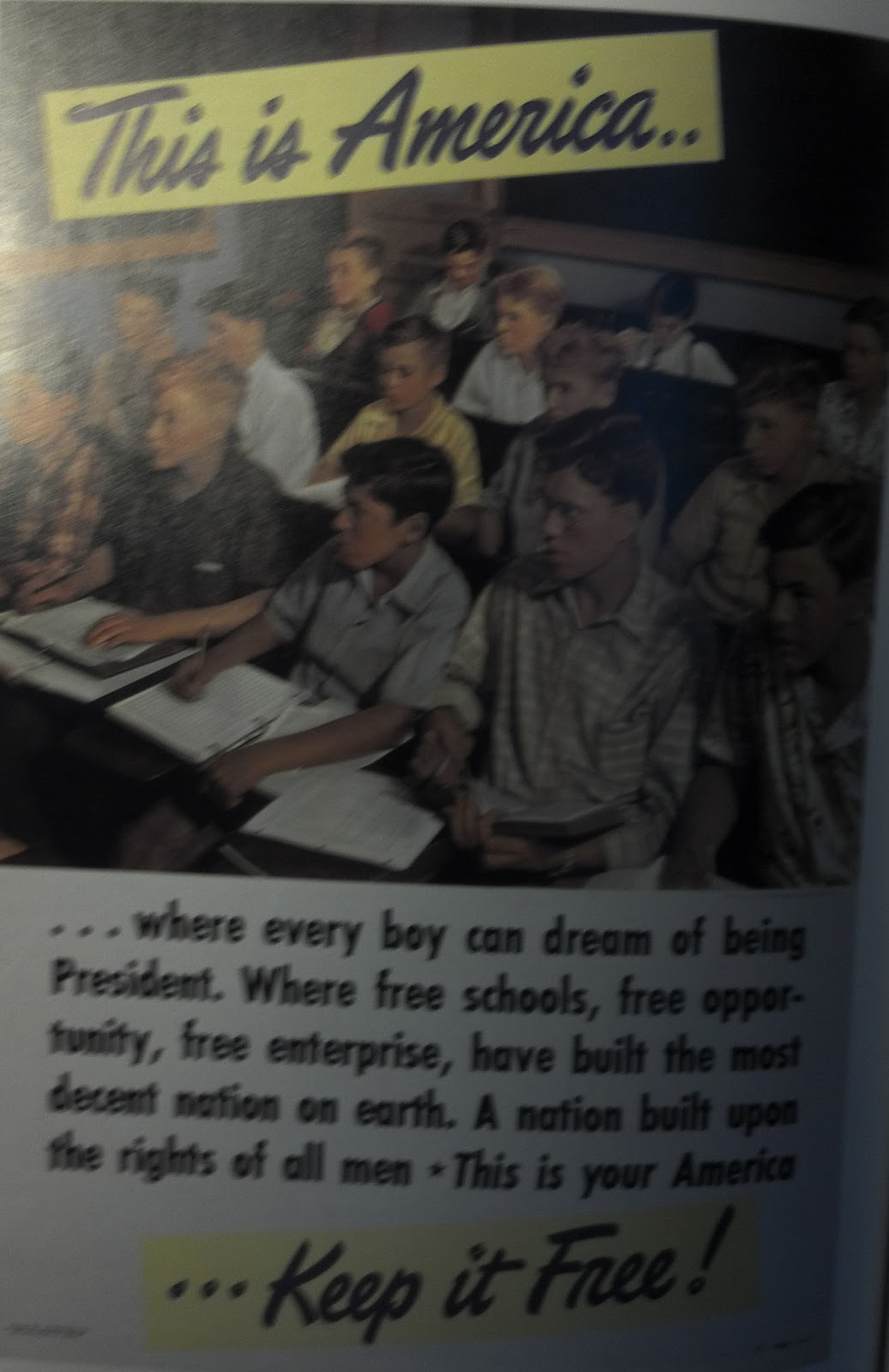
Design -69- Keep it free

 Oh boy another old school American poster. This one is interesting because it's promoting all of the freedom, dreams, and hope that the country has. "This is America" and "Keep it Free!" being broken up as it is wraps up the entire piece nicely. It's pretty much just what it is an old school United States propaganda poster about "how awesome and free" we are.

Typography -62- Save our Water

The font is a bit boring for the images that go with this design, and the kerning is pretty tight. I think the whole thing could have become more interesting is the text was white and inside the picture of the fish so everything would be more pulled together.

Design -68- Save our Planet

The halftone dots at the top of the page are bothering me because they don't seem to fit in with the rest of the design at this point. The colors on the fish are a bit dark; I had to fix the levels of the picture I took, but they were fairly dark to begin with. I do like the underwater fish thing. These underwater scenes are always really cool to look at, so I will give them that.

Monday, November 26, 2012

Typography -61- PToT


Each letter symbol of each typeface and the name are actually written in that typeface which is really cool so you have an idea of what each one looks like. This makes it a good resource to have when looking for a font to use when you're tired of scrolling through the list on your computer.

Everything else is consistent like the fonts of all the other information. The sources are listed to the left of the final block of script fonts making good use of that space. The title "Periodic Table of" being broken up over the word typefaces is also a cool little typography thing using the ascenders of the font.

Design -67- Periodic Table of Typefaces

My teacher at the Career and Technology teacher my senior year actually gave me a placemat of this, so it's something that I see every day hanging up on my cork board.

The relation between types and elements is just brilliant and goes to show you that design has a science to it and an order just as Chemistry. The Tan background is very nuteral and doesn't distract one from the important information presented. It even parodies the real periodic table with each typeface being listed in order of most used, the type (serif or san serif), the family it falls into, the designer, and the year designed.

This is probably the nerdiest thing that I own, but i still think it's pretty cool none the less.

Design -66- Box Art III (Comparison)


(Thank you Google for having bad formatting to where I can't simply put this images side by side without a bunch of nonsense and headaches.)

Now I'd like to take a comparative look at these two different boxes. The Japanese one is more exciting and playful with it's cartoony style, and the lighter colors. The North American box art is darker, and takes itself much more seriously.

I just noticed that the gradient on the NA box are is similar to the gradient on the 2 of the JP box. I'm not sure if they were trying to copy it but if they were thy failed at it. The Japanese one actually looks like a stream of light reflecting off of a metallic number while the NA one just looks like crap.

Something even more interesting is that the blue of the Japanese box art spreads into the Green making it more relaxed. The North American box art however, uses purple which is a dark color and it chokes the colors on the inside making it more tense.

There's also the fact that everything on the Japanese box is very horizontal while the North American one is very vertical. They even have that random save $10 banner going diagonally across the edge which is different and changing the movement of the piece.

I'm not sure how the box art affected the sales of the North American version of Mega Man 2, but it's interesting to see two totally different designs for the same essential game. This is not by any means all that could be said about this, and I could go on for hours and probably start a YouTube series about the differences in box art, but for now this must come to an end.

Typography -60- Box Art II (JP)

The title is the most important thing there and it stands out well. Capcom the creator of the game is listed up in the top right, and then again in the copyright under the number 2. All of the text is easy to distinguish from everything else is going on. I can' get too into it because I can't read japanese but from what I see all of the text is very apparent.

Design -65- Box Art II (JP)

Now that I've talked about the North American box art on it's own design wise I want to turn the focus to the original Japanese box art.


This design of everything coming to a point at the top where Dr. Wily's castle is located actually reminds me of this comic book cover design type list I saw. The artwork and design here is just brutally japanese. All of the robot masters are shown behind our protagonist, and the bad guy's lair is at the very top behind everything just out of reach looming over us. Various enemies in the game are floating around taking up the space that would otherwise become blank. It's exciting, bold, and pretty much what Japan does in it's designs.

Final thoughts, I like how things are coming out of the area in the center, it's not just a boundary area. The mint green color is also very relaxing in contrast with the exciting cover artwork so I feel that it works very well together.

Typography -59- Box Art I (NA)

Something I can't even comprehend is the gradient on the title. The weight of it is really weird. It stands out well but it has this sunset thing going on. Mega Man and 2 coming facing opposite directions creates this point where your eye is kind of forced because of the direction of the words. Everything else on here is just information that's slapped on every other Nintendo and or Capcom game so there's not much else that I can actually say about it.

Design -64- Box Art I (NA)

This is a design topic that I've wanted to hit for a long time now. The differences between North American game box art versus the Japanese versions. It's interesting because back in the day most games originated from Japan, so you could tell they tried to tone things down so they'd sell to Americans. My example for this will be Mega Man 2 which is notorious for really weird box art.


The art is very western stylized while still showing the contents of some of the different levels all in one package on the front cover. The purple boarder is working in good contrast with the warm reds and yellows used, and it takes itself pretty seriously for a video game. 

Typography -58- School of Visual Arts


The line "Having a talent isn't worth much unless you know what to do with it' stand out really well, and it looks good above the pencil. I would move the large block of text on the very top to the bottom to balance out the weight of the piece, because black text carries more weight than the illustration.

Design -63- school of visual arts

Another piece that I'm going to go lighter on because it's dated. I really like the visual element of the pencil wrapping around so the tip is touching the eraser. It's something that still represents the problems of an artist today. The hand drawn look is pretty cool and I think would still play over well today.

Typography -57- DRUM

I didn't bother to record when this poster was from but from the text I'm guessing based on the text and color it was probably somewhere around the mid 20th century. "Listen to the drum" stands out really well but the words "raise your voice" underneath pale. I'm guessing the first letter capitalized is an attention grabber but honestly it bothers me, and the rest of the text is all caps so why not just do the same?

Design -62- Listen to the drum


I can't believe there was actually a design telling people to answer the census like this. I'm not sure who this appealed to back in the day when this was advertised. It's a cool design, but I don't know how many citizens actually liked that draw between us as Americans and native tribes.

Design -61- Brand Identity

I'm going to break off from my typical critiques to bring something to your attention. I found this interesting comic on XKCD about brand identity.


It hit me how easily this simple design style stood out with all of these different products. I couldn't even match up brands of other things on the shelf in this comic. So I nodded and agreed that it did come out as a strong brand because it's really simple.

Then it hit me...


What's illustrated here is exactly what's done in the Great Value brand. Think about it; how well does the great value stuff stand out on the shelves when you're walking through an isle? It was insane making this connection between a simple web comic and branding in the real world.

Typography -56- American Style

First of all I want to talk about the font. The large san-serif font feels very old school American. The author's name is a bit in the shadows which is okay, but the Author seems to be underplayed because their name is the smallest and least noticeable thing on the page. The leading on the top is also bothering me. I'm not sure if the lighter text overlapping is a stylistic thing that was once popular but it's bothering me really badly. It would have been really easy to screw that up if the colors of the two text lines didn't contrast that well.

Design -60- American Style

This book cover stood out to be because it emulates the American style very much. The icon Uncle Sam's finger pointing at the viewer pulls into posters that you think about when you try to remember original American posters. The background of the book is actually the red and white stripes of our flag, and having the hand tearing through puts strong emphasis on that design element.

Typography -55- 1943

There's very little type on this page because the piece mostly requires the viewer to have some back knowledge of what it's about.The only text on the page "October 1943" could be a bit bigger, but the red underline was a nice touch to give it emphasis.

Design -59- 1943

This piece requires a bit of context. it's meant to be for the rescue of Danish Jews who escaped to Sweden in 1943. The colors very nicely resemble the colors of he swedish flag and the star of david is a recognizable symbol for the jewish faith.

Thursday, November 22, 2012

Typography -54- ZZAJ

The low weight font actually works well for the word JAZZ since it's in white. The words in blue underneath it are becoming invisible though because they're so close to the background blue.

Design -58- Jazz

Whatever the objects look cool with the warm color scheme. The colors are well used for the objects themselves and the heavier colors are on the bottom.

Design -57- I forgot

The fading out of the word Alzheimer's is a good representation of the memory loss of those who suffer from the disease. There isn't any information though which makes it bland. Is this promoting awareness, or what exactly is this for? It's one word on paper.

Typograpy - 53- Boxing

The important information in the header being bold is a good technique. The text in the bottom right could stand out a bit more.

Design -56- Boxing

The colors on the black really make the design pop out. The information's organization is a little weird, but it does provide a diagonal from the top left down to the bottom right where the times are.

Wednesday, November 21, 2012

Typography -52- Brown note

There's only a little type on this page. What's there is okay, it's a bit small but it's underlined for emphasis. Other than that there's a real lack of information/type on this entire design.

Design -55- Caregie Hall

I'm going to go on a bit of a tangent here. This is how you use complementary colors. A main color and a fraction of it's complement used along side it. They're not too bright so it doesn't hurt the eyes and they're significantly less of one than the other. Because there's less yellow they're not fighting as much for attention and it creates a pop rather than a punch in the face. I've seen complimentary colors used in equal ratios and it just becomes eye gouging when they're equally used and even more so when they're really bright. The paper airplane made out of music sheet is creative for a design piece to draw the eye. However there is a lack of information.

Typography -51- art fun love thrill beauty

The five words are attention grabbers. The font is nice and the simplicity of one makes sense with this overly simple design. The word fun being orange is bothering me though because it's the only odd one out. The orange is really close to the red, and it would have made more sense for it to be yellow to create a pattern.

Design -54- Danish Films

This poster isn't really saying anything to me. I want to sit here and get all of the meaning from the words, but it's just that, colored words on a red background.

Typography - 50 - Lemon Lime Drink

Something I never noticed about Sprite is how custom the font on the front is. Coca Cola itself has a really unique trademark font, and I never noticed that they customized the font for Sprite. The word itself also has and offset that just lets the color of the aluminum through to the right of the words. The consistency with type is alright. Important stuff is bold, what's not isn't The ingredients could stand out a bit better. I know they put blue behind it to do that and bold might ruin it, plus it's soda why put the ingredients in bold it would never sell if people were reading what kind of junk is in there all the time rather than drinking it.

Design - 53 - Sprite

Sprite's logo here gives a some motion to this design which wouldn't be achieved well if the name wasn't at an angle. Not shown in this picture is how they lebel that the soda is a part of the Coca Cola company; the words go up the side of the nutrition facts label with Coca Cola being in it's trademark font. There's also this interesting thing going on where there's blue behind the ingredients to make them more readable, and then the nutrition facts label itself is a brighter green than the rest of the can. It's a pretty subtle thing that you can really only notice if you're looking at it hard enough. The only weird thing about the can is this dark line that goes down one side. I'm guessing it has something to do with the label itself but I would think there's a way to get rid of this and make the design streamline.

Thursday, November 15, 2012

Typography - 49 - Hand

The header could use some love and attention. It just barely stand out more than the rest o the text on the page. Everything on this page is center and it works because the hands are almost making this column coming down the center of the page; however, the paragraph below the subheader line is so close to being justified that I would have just gone ahead and done that.

Design - 52 - Hands could use a hand

I like that in this ad for the Delta touch faucet the pictures are doing most of the talking for it. The logo stands out and the text stays away from the edges. Now going back to the logo, it's directly in the center of the page. It would probably be better if it were aligned with the scan code and moved to the left to balance out the page just a bit more if not giving it this triangle shape between the logo, the code, and the header.

Typography -48 - makes it matter

The font at the top of this page is just awful. I know they were going for a handwriting type of thing but everything differs. First of f it switches between being all caps or all lowercase. Then there's the word into which suddenly switches to be written as if it were in cursive while the rest is huge print. The body type could also be bold or something because honestly I feel like neglecting the words and instead just look at the "pretty pictures." That text is important and it needs to stand out more.

Design - 51 - HP

I chose to talk about this particular page because of the reference to the movie Madagascar, and the computer companyHP which is one of the better "PC" companies. The HP logo is up way too high and would work better if it were closer to the bottom of the page. I do however really like the mix between what is real and what is animated.

Typography - 47 - AAA

Text that is important in the bubbles is yellow to give it contrast compared to the white text below it. The text in a block between the two logos is pretty sound, no big complaints. Everything is surprisingly good in this little ad.

Design - 50 - Triple A

Right off the bat I can see that none of the text gets too close to the edge of the page. The text has a slight gradient to it but I think that works for the company because they deal with cars and mechanical issues. The two company logos are in the bottom left and right corners of the ad which balance each other out.

Wednesday, November 14, 2012

Typography - 46 - Gillette

I like that there's not too much information here; the whole piece speaks for itself. I think that the text could stand to be a bit smaller.

Design - 49 - RAZOR

I like that most of this advertisement goes on top of a black background, and that's something that I would like to see brought all the way to the edges of the paper at least on the top and right edge, the bottom can stay the same. The representation of the layers with the different colors is very nice and brings the point across that this is a very nice razor.