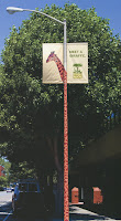
The text here is pretty cool too. The colors fit with the logo of the San Francisco Zoo itself. It's easy to read, good kerning and leading. Even the logo itself has a fairly good use of type. The only thing that would have made this really amazing is if "meet a giraffe" was in the same font as "San Francisco Zoo" but might have not worked, and wasn't weighted enough for the usage of the design. Who knows? Only the designer who made this does, but whoever they are, they're pretty cool in my book.

No comments:
Post a Comment