Thursday, October 11, 2012
Design -18- Communist Poster
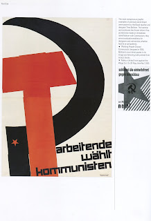
I found this book in my library called Swiss Graphic Design. The majority of this book contained communist propaganda posters, and this one stuck out to me the most. The colors in most of the posters remains black and red which is given high contrast against a background. This one portrays the hammer and sickle, one in red and the other in black and the black sickle bearing the five point star. The text reads "working people choose communist," and was created by Theo Ballmer in 1935. While the design is simple it portrays what it needs very easily and get the point across, although the text kind of gets lost on the colored hammer. The entire piece is canted to the left as well which gives an empowering feel, making good use of that technique.
Subscribe to:
Post Comments (Atom)

No comments:
Post a Comment