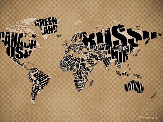
In my pursuit to find different sources of typographic inspiration I came across this piece. It's a pretty poorly crafted map of the world with each country written in it's territory. The type is difficult to read and cuts off in almost every name, and they obviously cut out Alaska and Hawaii to make it easier on themselves as well. Despite this the font is bold enough to read and appropriately changes for the smaller countries. I managed to find more examples of this idea, each with varying complexity.
None of these are perfect and all have readability issues but the idea is one that seems to be widely inspiring.


No comments:
Post a Comment