Sunday, September 30, 2012

Design - 13 - Brand

"Brand elements

Brands typically are made up of various elements, such as:[14]
  • Name: The word or words used to identify a company, product, service, or concept.
  • Logo: The visual trademark that identifies the brand.
  • Tagline or Catchphrase: "The Quicker Picker Upper" is associated with Bounty paper towels. "Can you hear me now" is an important part of the Verizon brand.
  • Graphics: The dynamic ribbon is a trademarked part of Coca-Cola's brand.
  • Shapes: The distinctive shapes of the Coca-Cola bottle and of the Volkswagen Beetle are trademarked elements of those brands.
  • Colors: Owens-Corning is the only brand of fiberglass insulation that can be pink.
  • Sounds: A unique tune or set of notes can denote a brand. NBC's chimes are a famous example.
  • Scents: The rose-jasmine-musk scent of Chanel No. 5 is trademarked.
  • Tastes: Kentucky Fried Chicken has trademarked its special recipe of eleven herbs and spices for fried chicken.
  • Movements: Lamborghini has trademarked the upward motion of its car doors."

    I found this on the Wikipedia page for brand. The first six are actually right on for the main parts of brand, and the rest get into really subtle parts of a brand that I hadn't ever thought of. It's interesting how deep a brand can go especially the really well known ones.

Typography - 13 - Branded Type

I just found another cover from this author we covered during our example book cover lecture. It's exactly the same concept as the other one except this time everything is in red. Once again I don't understand why there's a review on the front it seems really out of place. People would probably question who Tobais Wolff is and what his connection to the book is. It's almost interesting how these poor designs continue without correction.

Thursday, September 27, 2012

Design - 12 - Mail Call


Excuse the alignment of the pictures, I tried to get them to align across the top but Google keeps fighting me on it. 

I took a look at how companies incorporate their logo and branding into their own envelopes. Most seem to either put the logo or part of it on the top with the address and information from where the letter was sent from. I want to do something similar but become bolder and start breaking apart my logo and pushing it into being parts of the envelope creating the logo itself. 

Typography - 12 - What's my Title?

When looking at the book covers that were presented to us as what not to do I noticed that two covers in particular has type that made it hard to discern the title from the other garbage clouding the cover.


First off let's talk about the one on the left. The title of The Road  is clearly separated from the rest with the use of a white line that reminds me of the line that divides the shoulder and that actual lane. Despite this the idea is kind of... well completely screwed up by having "The Times" in the same white. The author's name could use some love as well.

The second one I couldn't even figure out at first. I know now that the title is A Fork Brought Along. I'm not even entirely sure why the cover has this chalkboard style cover. It could allude to something that happens in the story but that's beyond me at this point. The point is that there isn't much done to make the title pop as it should.

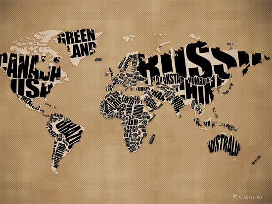
In my cover I'm planning on having type making out the shapes of objects to really get into hardcore typography. The only worry I have is that I could possibly cause a problem as these covers did.

Wednesday, September 26, 2012

Design - 11 - Generic

I had to share this. This is the most generic name that I've ever seen on any type of business. I'm hoping that this isn't the name and it's just stating "hey there's an Italian restaurant here," it seems doubtful though. The wonders of Westminster Maryland giving all of this weird design material to work with.

Typography - 11 - Font Enhancements

As I was on my way home one afternoon I noticed an awning with the name of the of a business on it.

I don't quite understand the purpose of his last name being bold. Maybe this is something needed when the logo is split onto two lines, but in this one line format it seems really unnecessary.

Typography - 10 - Typography Images


For my book cover I'm thinking of making a city scape or objects out of type. These are some pretty cool examples of type being used to make an image. I've went over this before with the video game heroes, but the objects that I will be creating will be more complex. These ones show a bit more of that complexity that I'm aiming for. Worst case I'll be creating either a nervous system or a city out of type. This will take a lot of time but it will really appeal to the meaning of the book and will look more impressive overall.

Tuesday, September 25, 2012

Design - 10 - Business Card Culture 2

I'm going to follow up to my Business Card Culture post quickly. In Japan when a business card is presented to the other party you are to take it holding onto the corners so that you are not covering up information. So in my business card I may want to incorporate larger margins than usual to make the card appropriate to both audiences.

On the flip side- wow that's an old saying- American business cards have a harmony between graphics and the information on the card, where Japanese cards are more information heavy. I'll have to lean more towards the US approach for it to be more appropriate for both, considering only some JP business cards are too text heavy.

Then to satisfy both I'm going to try the japanese style of having one side be all in Kanji while the opposing side is in English. I think this could be a unique spin that will make my business card stand out among the rest, even though it'll call for a little extra work.

Typography - 9 - Book Covers

Today while looking up information on the novel that we will be creating a book cover on I found the original cover of the book.

Now the cover is successful because it has a style and feel that relate to the story itself; however, the information doesn't seem to have any information. Too much is trying to be said on the front of the book. The blurb in white at the very top has more weight than everything else because it has the highest contrast with the background. This block of information also draws away from the title Neuromancer. Luckily the title and the author are bolder and larger than the rest of the text which helps it become more noticeable, yet the hierarchy is pretty much nonexistent.  It sees like this is a trend that is very common in books that were published in the later 20th century.

Saturday, September 22, 2012

Design - 9 - I can't even look at road signs

Yes, it's true... my work with graphic design has pushed me even further to the point where I can't even look at road signs without questioning how they could be made better.
I see this and all I can think now is "I wish that text was a bit bolder so it would hold it's own weight against that bike graphic. Otherwise the word looks like the ground and shows some creativity.

Sometimes it's not even critiquing the signs but thinking about the graphic hierarchy that was considered in the sign.
Okay the 32 is much more important because that's signifying what route in Maryland that you're on. The bold, black line also breaks up the two parts and kills off negative space.

This is great when you're constantly trying to think about how to improve a design; however, it can be a headache when you're just trying to get home in the afternoon.

Typography - 8 - Game Typography

Probably not what you're thinking. I'm talking about game characters made up of typography.
This is some of the coolest use of typography that I've ever seen. I've always loved the use of type to make an image and these take that to a whole new level. Each character (minus the creeper from Minecraft) is made of words describing them. It's hard to believe I found these on Deviantart of all places. Looks like that website actually does harbor some raw skills and talent.

Design - 8 - Proud Designer- Poor Designer

http://3oneseven.com/

This is the website I found the red and grey world typography piece. I took some time to look at their website and it's just terrible. First off the menu bar scrolls with the page covering information and anything. At least this is the case with everything but the one part that says what with the same orange color, which makes no sense at all. Then there's this-

Yes..."good design just works," except it seems that you don't know anything about good design. Your website is difficult to read and just ridiculous. The websites you've made for clients use the same bad design, and even your saying of "good design just works" is flawed because your leading is so small that it causes overlapping, compromising readability. Not to mention the arrows that look like they should collapse menus don't do anything except highlight when hovered. You have to click the actual word all the way to the right which still highlights the arrow which does nothing. I'm not the usual type of person to rant about these situations, but this impudence is just embarrassing.

Typography - 7 - World Typography


In my pursuit to find different sources of typographic inspiration I came across this piece. It's a pretty poorly crafted map of the world with each country written in it's territory. The type is difficult to read and cuts off in almost every name, and they obviously cut out Alaska and Hawaii to make it easier on themselves as well. Despite this the font is bold enough to read and appropriately changes for the smaller countries. I managed to find more examples of this idea, each with varying complexity.


None of these are perfect and all have readability issues but the idea is one that seems to be widely inspiring.

Thursday, September 20, 2012

Design - 7 - Business Card Culture

The purpose of business cards are pretty similar in the United States and Japan; however, in Japan there is more etiquette and culture surrounding the exchange of cards.

Japanese Business Card Example

American Business Card Example

As you can see the Japanese business card is more straight forward and about business and contact, while the American one is about catching the eye and being enjoyable while giving the information. The exchange of business cards in Japan is also very crucial and can effect how a designer chooses to lay out the visual and type elements. To satisfy both I'm going to put a bit more attention and research into this to find a way to make a card that will adequately satisfy both cultures. 

Wednesday, September 12, 2012

Design - 6 - The perfect font

I'm running out of time in my quest to find the perfect font for the Osaka letterhead. I'm going to default on my original idea of using the brush script in all caps to preserve the individual letters, and then downsize everything but the first letter to do small caps to give a calligraphy look. Once I do that I can quickly put together my letterhead itself.

Typography - 6 - Curving type

My design is coming along pretty well, better than I expected really. The gear shape is starting to look like it's supposed to. I made the outer circle out of the Canadian bands so the natives of where the concert will be held can locate local bands easily, and then the headlines in are the next inner circle in bold. The rest of the bands make up the teeth of the gear.  Hopefully there won't a problem with readability but a quick test print should take care of that.

Tuesday, September 11, 2012

Typography - 5 - Type and visuals

I've started adding the text to my poster for the Kinetik music festival. For a bit of added contrast I added a metallic looking gradient to the first gear just to make it pop a bit more instead of being a boring, cloudy grey. The shade of blood red is staying the same and even with the change it adds a nice contrast. I've already begun to shape my type into this circular gear shape, and it's going to take some serious work to get all of it in the shape I need, while still making the more important information pop. At least I threw the time, contact, and location information on the bottom almost opposite the festival logo on the top left; this freed up a lot of room in my shaped text.

Design - 5 - Color

Today our lecture was about color and it really causes you to give you color scheme a second thought when you're reminded of the connotations colors get. Black is a very strong, heavy color that at the same time kind of falls into the background and gets a little boring. Red is a passionate, fiery, exciting color, but can also be linked to caution and anxiety. I still think these work well because the black follows the idea of a silhouette and the color of ink used in calligraphy, and the red is of course the color that the Japanese associate with the sun.

Monday, September 10, 2012

Design - 4 - To the left!

I've noticed that having the sun in the center behind the castle in my Osaka logo is a bit bland. I'm going to try the advice I received to move it off to the left a bit and it'll be behind both the words Osaka Tourism and the silhouette of Osaka Castle. I'm hoping this movement frees up my logo and keeps it from looking really static and boring.

Typography 4- Warp Text

So today I get to have the misforture pleasure of warping my text for the Kinetik poster into the shape of a gear. This isn't a hard task, but very simple problems can occur and you have to first create the curved path that the text will be written on.

Thursday, September 6, 2012

Typography - 3 - Tracing a complex shape

Yesterday I was reacquainted with the pen tool in illustrator for the purpose of tracing over a shape to make a vector object. It was actually pretty painless compared to some of my first experiences with Illustrator. I successfully created the outside gear shape, teeth and all, and then I was able to use the pathfinder to exclude the center of the shape. The only problem I ran into was one time where for some reason the space in between two teeth was filled in for some reason, but it wasn't too hard to take care of and then move my points back into place.

Design - 3 - Color scheme

    For my Osaka Tourism logo and letterhead I've been playing around with ideas for a color scheme for awhile now. originally I was going to crate an illustrator icon version of Osaka Castle usig the same colors as the building itself; now my design has become a black silhouette with a red sun in the background.

I've decided to do lines separating the head and footers from the body itself. The lines will be black with a red line through them which should follow the color scheme well.

I've also gotten some peer help with ideas for more "out there" ways to go about laying out my letter head.

Wednesday, September 5, 2012

Desgin - 2 - Simplify

Having a design that's too complex or too simple can really ruin a design. In my design for Osaka Tourism I've decided to simplify the castle in my logo to be a silhouette only instead of a detailed piece using the same color scheme as the real castle. this is to save myself time, and the frustration of having a really wacky color scheme that would go with the colors of Osaka Castle itself. The colors of the castle are green, white and gold which would be very difficult to put together into a working color scheme for the letterhead itself. Keeping the castle as a silhouette and then adding a red sun behind it (to symbolize  Osaka being part of Japan,) it provided a simple and good looking color scheme.

In the realm of simplification I've looked around the college campus and noticed posters that were either too simple or had too many graphical elements jamming up the flow of the overall piece. Some pieces were so simple that they didn't actually get the parody across that they were trying to throw back to; A different piece that was about the Fall Festival had a very nice background of leaves and a illustrator deer with an offset in black, but they overcomplicated the design by making some of the letters in the title "Fall Fest" look like they were made out of leaves putting a huge dent in the readability.