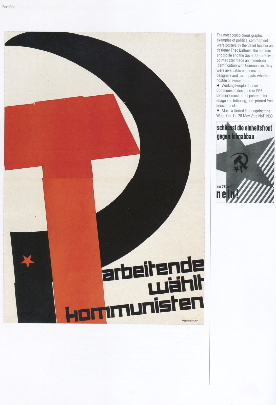
Now I'm going to go into the limited amount of typography in this piece of work. The text is canted, but not so much that the words become unreadable. The font is also bold, square, and no nonsense which solidifies the strong ideas and meanings behind it. The only real flaw is that the text overlaps the hammer and it makes it a little harder to read, but the text is bold and dark so it's not as bad as it could be.
No comments:
Post a Comment