I've been looking at the way double sided business cards have been used in American culture; the result is pretty sad actually.

This card for example doesn't bring anything new to the table on the reverse side. The one on top could actually be a stand alone. What is that reverse side doing for this photographer besides costing him more money a pop?

This one is getting closer but the same information is once again repeated on the front and back. If www.mst.edu was removed from the information heavy side and only had the admissions site then it would be better. There could also be general phone number on the front side.
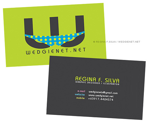
I think that this one comes the closest. The front side is all about hte company itself. It has the logo and website. Flip it over; now you're looking at the designer's information. The website doesn't really need to be repeated and then you'd have two lines of info on her and two lines of contact creating a stronger parallel, but it's close.
No comments:
Post a Comment