I like the color scheme of blue and white. The yellow also pops out because it's a split compliment of the blue. The leaves bordering the edge of the label add to the nature or "natural feeling." The curve of the banner isn't really necessary but I guess it helps you understand what it is; it's still not entirely necessary to have it curve though.
Monday, October 29, 2012
Typography -41- Deer Park
The leading and kearning on the brand name are good for the limited amount of space. The yellow banner adds the necessary weight to "natural spring water." The establishment date seems a bit crushed and lost in the big mash of text though.
Typography -40- time
The test is pretty neatly done on the right. It's a little tight, but the centered alignment is leading the eye downward to me. The "Time Zones Transcended" header is leading me over to the body copy, but it still looks really weird. It could have been done just as easily with the stair stepping technique where the next line is a bit longer than the last.
Design -42- Time zones Transcended
Design wise I like the diagonal split between the text area and the picture. It makes it so the text isn't muddied up by other distractions. This could be a problem if the text was directly on top of the image itself. The diagonal doesn't seem to be used much, but it's fresh compared to a simple break with the white space placed in a box somewhere on the page.
Friday, October 26, 2012
Typography -39- Boat Ad
There's good continuity in the text of this ad. The font isn't deviated from at all. The text at the very bottom could be bold to make it a bit stronger compared to the larger text above it. I'm not sure if this is really a big problem because there is a good amount of space between all the lines. It's an idea though.
Design -41- Boat ad
The issue of text being cut off on the inside edge is easily avoided in this advertisement; however, almost everything is centered. This is okay because I'm being lead from the top to bottom, but it's not leading me as strongly as it should. I do however like how there are visual elements like the ribbons bringing the image and the bottom blue box together. The dark blue box is also giving a good amount of weight to the bottom of the page.
Desgin -40- Water Bottle
This label is pretty simple as I've said in the typography blog. The choice of color is interesting though. Coca Cola, which is the owner of Desani, has a brand color of red and white which doesn't work for a water bottle. The blue label with a water droplet texture is more refreshing and gives it a nice, cool feeling.
Typography - 38- Water bottle
I think this is an older logo of Dasani's. The name is clear and in a font that they've chosen to be part of their brand. They even include the words "coca cola" in their traditional font adding more branding. Then the smaller text being broken up between the top and bottom balance out the label. The text on the bottom looks to be slightly bolder which adds the weight it needs to pull off the design.
Typography -37- Magazine ad I
The informational hierarchy seems pretty sound in this ad. The text at the very bottom is a little small. I'm assuming it's all the traps and bottom line that they don't tell you outright. There might be a little too much body copy of type that could turn people away from actually looking at this page for too long.
Design -39- Magazine ad I
This advertisement makes an interesting use of an image to create the white background which the colored text is placed upon. The text is also spaced far enough from the left edge which is something that always needs to be considered when creating a piece that will be bound in some sort of print.
Thursday, October 18, 2012
Typography - 36 - Cola
I kind of hate to criticize the typography of a Coca-Cola ad. It feels like "you have the audacity to correct Coca-Cola a company that was serving your grandparents refreshing beverages?" Well the only thing weird is the way the type runs on this page. I have to tilt my head to read it, but it also gives the feels of the chinese language which is read from top to bottom. It could just be a sacrifice they made to make a serious first impression, and not to necessarily agree with designers. Like what's been said in this class. You can't always design to please other designers, it doesn't work that way.
Design - 38 - Coca Cola
Design - 37 Overkill
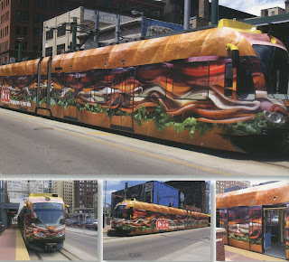
When I first saw this I really wanted to get a sub. I have no idea who has the money to go out and do something like this? Well obviously Cub does who decided that they needed to bring more than food to the table like in their slogan and turn a bus into a sub. I think the name of the insane endorsers of this monstrous sandwich should be visible from more than one angle. I cannot get over the magnitude of this ad.
Typography - 35 - insert witty title here

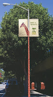
The text here is pretty cool too. The colors fit with the logo of the San Francisco Zoo itself. It's easy to read, good kerning and leading. Even the logo itself has a fairly good use of type. The only thing that would have made this really amazing is if "meet a giraffe" was in the same font as "San Francisco Zoo" but might have not worked, and wasn't weighted enough for the usage of the design. Who knows? Only the designer who made this does, but whoever they are, they're pretty cool in my book.
Design - 37 - Thinking outside of the print
This is another design that just made me smile the second that I saw it. Usually you see things printed on paper, a banner, a flag, but for the design to extend outside of that and become something even more palpable. This is really cool, ad it probably took a lot of cooperation from the city of San Francisco to do this. It looks like the giraffe pattern is just a wrap around the pole, but that extension of the design is really impressive.
Design - 36 - Reynolds Wrap, more quality than you think
There can't even be a typography post on this one. I just think this is the most amazing and witty ad I've ever seen. I mean the protective metal door to the shop is coming out of a reynolds wrap box look alike sign. I want to go out and get some right now just because of how cool this is. I can't find a single thing wrong with this. Even the package design is sound.
This is just awesome.
Typography - 34 - reDUMBdant
Bad pun about how I feel breaking these posts up in this way.
I really feel that the bottom left text about the optical zoom would be so much more effective in the top left. That way you get "hey this thing zooms in" and then "whoa that object is zoomed in so much it looks like it's actually in the city!" Finally you get "Panasonic made this possible, this is our work." That little bit would have made it so much more effective. Granted that the image of the statue would probably have to be moved to the right more to make this work but I think it could become a game changer in the effectiveness of this piece.
I really feel that the bottom left text about the optical zoom would be so much more effective in the top left. That way you get "hey this thing zooms in" and then "whoa that object is zoomed in so much it looks like it's actually in the city!" Finally you get "Panasonic made this possible, this is our work." That little bit would have made it so much more effective. Granted that the image of the statue would probably have to be moved to the right more to make this work but I think it could become a game changer in the effectiveness of this piece.
Design - 35 - zoom, zoom, no
This is a pretty creative advertisement. To represent the optical zoom by dragging the statue of liberty throughout the city of New York is pretty brilliant. The placement of the text bothers me because there's no diagonal.
Typography - 33 - your people _________ ready
I understand that the dash is supposed to be where you're inserting a person into the idea of this text, but it's kind of breaking up the scentence. I also don't totally understand the emphasis on just people and ready. All of these words are important like "your, people, ready, creative, next" why are only some of them standing out more when it's more important as an overall message? There is a good call on the white text, that jumps out so kudos Microsoft, you made an almost amazing advertisement that missed by this ____ much.
Design - 34 - Your people
These advertisements for Microsoft are pretty freaking cool. The white silhouette of the person standing in the middle of each room is pretty cool and leaves you to imagine yourself or someone in that place. I like the photos of the rooms used. The Microsoft logo could be a bit more prominent and a diagonal would be nice, or to have the logo in a place like the top left or bottom right where it would make sense to be placed in the order that you would actually read things.
Typography - 32 - Build
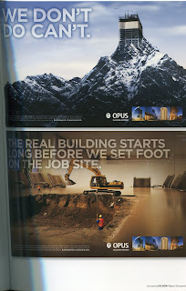
"Greg what in the world could you say about this one that you haven't already said abut the typography in the other ones?" Well this one is I took a second glance at the text in the bottom left and it's not as bad as previously stated. I do think it could stand out a bit more but possibly not as dramatically as the other one. I also think that the four lines of the important text is way too much. Also "We build to more" doesn't even make sense. Shouldn't it be "We build more than a blueprint?" Come on guys your design looks really cool and you messed up the most important text in the entire advertisement.
Design - 33 - What we build
This another variation on the OPUS advertisements. The reason I want this one to be separate from the others is because it's not nearly as abstract and out there as the others are. In the others there was obviously some photoshopping going on; yet, in this one someone totally could have drawn that fingerprint in the dirt and tht's what makes this so cool.
Typography - 31 - What we don't
I have to say first of all is that the largest text on the page is opaque making it noticeable yet not intrusive. The logo's type size is pretty good it could be a bit more noticeable but that would only be needed if the text in the bottom left was fixed. It doesn't pop at all and I don't feel compelled to read it at all.
Design - 32 - What we do
I really like these designs. The photos are well places on the page more so on the top one rather than the bottom one. I really like how they each combine two images photoshopped together to make something impossible look possible.
Typography - 30 - LIGHTS
The text here is so tiny. Seriously what the heck is going on with these ads that they eel like the image is worth a thousand words. Guess what that may be true but it would still be nice to have some text that's legible so I can understand why I'm looking at a freaking light switch.
Design - 31 - Lights!
I'm not even going to get into what these are about. I like how all of these are the same design but with different color and new text accompanying each one.There's a lot of negative space that I think could have be filled a bit more, but it's pretty simplistic.
Typography - 29 - Deforestation
Design - 30 - Deforestation
This piece has a strong message once you realize what it's about. The theme of these pieces are that "deforestation breaks up families." The sepia tone of the images give a very serious feeling while the pictures that the animals hold are more vibrant and lively like the time before a disaster. The composition is pretty good throughout, I don't feel like my eye is lead with the important information of the text ut that's something that I will cover in typography.
Typography - 28 - Stay Calm and eat drink and be merry
I like the color of the text, it's not too dark here and follows a scheme. Like I already said the " & BE MERRY" could be moved down so it's not being covered by the arm. Also the bottom text could have a bit better information because I'm still not sure what I'm looking at.
Design - 29 - Eat Drink and be confused
I'm kind of confused about the purpose of this piece. The grapes in the background allude to the "drink" so it makes me think of some wine festival, but the text at the very bottom doesn't really explain anything. I like the Otherwise it's pretty well composed. The arm covers the text a bit, but otherwise no huge complaints.
Wednesday, October 17, 2012
Typography - 27- Detergent Isle
I've noticed how almost every detergent bottle has large san serif fonts for the brand name. Something that always catches the eye right away after you've gotten over the fact that the color scheme is burning your retinas. Once you've seen the name in the largest print you have smaller type giving all the information and promises that this laundry detergent will banish the dirt and grass stains to the depths of hell. The size of the type makes up this heirarchy. Boom product name, bam promises of how you'll spill tears when you smell the fresh linen goodness. WHAP how many loads of this product your measly washing machine can handle without bursting into a sud infested whirlpool.
Design - 28 - Detergent Isle
It happened... inadvertently, but it still happened. I found myself helplessly wandering the isles of
Wal-Mart in Westminster Maryland. I soon found myself surrounded by them. Detergent bottles everywhere! The bright colors and large fonts surrounding me. The point of purchase each carefully crafted into an eye gouging, popping design. High contrast, large test, these monsters had me cornered. I barely got out alive.
Wal-Mart in Westminster Maryland. I soon found myself surrounded by them. Detergent bottles everywhere! The bright colors and large fonts surrounding me. The point of purchase each carefully crafted into an eye gouging, popping design. High contrast, large test, these monsters had me cornered. I barely got out alive.
Typography - 26 - Olympics
The test on the flags are pretty well composed. The important information is at the top; however, the words candidate city are kind of being crushed underneath the larger words Osaka 2008. The leading and kerning are good; there aren't any legibility issues. Even on the abstract flags the test stands out because it's white.
Design - 27 - Olympic
This is a flag design tht was used when osaka was up for the host city for the olympics. One side has the same simple design with the words and flower logo representing the city whist the other side has an abstract design that I assume. The weight on each one is pretty well and there aren't any major flaws.
Sunday, October 14, 2012
Design -26- Icon
I found these simple icons in that Japanese design book. Now they're all fairly simple yet they get the message across very easily. The icons like the men and women's restroom use simplistic icons of men and women stick figures and blue vs red (usually pink) to contrast the two genders. There are some that I don't quite get like the icon for school which honestly just looks like a chef's hat, but I'm sure it has some significance within their culture. All and all I think these make a fairly interesting comparison against our own simple icons.
Typography -25- Practical Kitchen
This poster has a unique approach to typography. While the information pops out in an off white color the title of the event is bold and black making it still stand out despite the color choice. The heavy bold font also fits the theme of the poster that the event is about practical kitchen space, not friendly design.
Thursday, October 11, 2012
Design -25- Japanese play poster
At least I assume this is a play poster, it was never really made clear in the book. It works because it seems like there's about to be a show going on, and the negative space feels like a stage. There's not many typographical elements but I think the words on the left can be a bit bigger. Otherwise it's less of a poster and more of just a picture.
Typography -24- Snack pack text wrap
There's not really much text wrap here but it made the title a little bit more awesome. Despite the characters in the middl seeming to have a stroke it kind of works well with japanese characters and it pulls the blue off of the red. The type in the red circle wraps around the red circle and fits in the objects naturally using the shape that leads the eye. I'm assuming the information is hierarchal, I'm not sure about the white above the blue which I assume is the name. If anything it balances out the amount of text one the top and bottom.
Design -24- Fruit Snack Pack
I really like this packaging. The space is used in a way that makes it exciting and not cluttered. The amount of color and pictures of fruit make me think that this is going to be the most amazing fruit snacks in the world. I can't find too much that I would change about this piece.
Typography -23- limited space, more type
The space on this packaging is used pretty well. There's not much room, but everything is pretty easy to read on each individual package. I also like how the text changes orientation; it doesn't cross me as hard to read as much as it reads "hey we're good at conserving space."
Design -23- Gum in Japan
This is another image form this big book on Japanese design that I found. The design on these packages is kind of simples and leaves something to be desired, but they do make good use of what space is there. The point of purchase is also there because the names are big bold, and the color of the packages are bright except for the black one which has big white text to contrast.
Typography -22- Non Latin formatting

Let's take a look at these two packages again. Is it apparent that there is not much more to changing up the type than making the strokes thicker or making the characters themselves smaller? When I was working on my business card I noticed that the normal options of bold, italic, ect. were all replaced with simple letters that only changed the size and weight of the character. Italics are something that don't translate to Japanese well because slight alteration to the symbols can completely change the meaning. There are even situations where a everyday word can have a similar character to say "prostitute" and only one stroke is changed to make a completely different word that could be very inappropriate in that context.
Design -22- JP Food Packaging
I've noticed that a lot of packaging the food packaging here has some sort of transparency. Then the logos and brand elements are kept simple. There are some areas where the symmetry is very heavy on one side than the other; I think this once again ties into the habit of including a lot of information right there on the front of the package. That's some of these, and note all. Bottom left is pretty symmetrical while dead center has more information on our right (the left of the package itself.)
Typography -21- JP Snack Package
It's pretty hard to jude the typography of a language that's tremendously different from your native tongue, but from what I can tell the typography is okay. The name and type of food are right down the middle in between the images of the food itself which is great. Then there's the text that runs into the images themselves which provides a bit of depth, but on the white package the test is orange trailing onto an orange object.
Design -21- Japanese snack packaging
Something that the Japanese are good at, is point of purchase. I'm not even totally sure what these products are but the packaging alone makes me want to at least try them. The design is a bit cluttered because they feel the need to put all the information possible on each package, or it could just be the difference in language and their writing isn't as space forgiving.
Typography -20- Trade Poster
The text is fairly easy to read for the most part except for the names in the red on the bottom half. The hierarchy isn't quite where it needs to be because the names of those tradespeople should be more promident. They're the focus of the event. Despite this one of the cool things about this poster is that the 27 and 28 don't end up crushing anything else because of the color change in the bottom half.
Design -20- Trades
 |
| Tradesperson fair poster by Rosmarie Tissi, 1956 |
Typography -19- Photography the Poster
The text in this page was arranged for a specific purpose. It becomes a problem in readability and leading the eye however. I have to tilt my head to read what's on the left line of text. Everything is all caps as well and everything is even and blocky. This worked in the communism poster, but in a poster about design related topics, it's kind of insulting.
Subscribe to:
Comments (Atom)


