Tuesday, April 9, 2013
Web -27- Canada
Canada's government page is a lot less formal and more friendly looking than the United State's website but comes with come compromises. I don't see much purpose for the words on both sides of the maple leaf. They could easily be part of the black header bar and then have the leaf going in between the two somehow. Also I think a lot more could be put into the navigation because it doesn't even go across the width of the page. I'd also like to see a bit more of a color scheme to the entire site. I know Canada only uses red and white for colors so blue seems out of place and the background actually looks like a powerpoint slide design.
Web -26- Whitehouse
The website of the United States government. No pressure to make a good impression here right? Everything is clean and contemporary. There are a few things I don't care for but don't make a huge issue with the site like the location of the search bar, or the one right body area overlapping the image of the picture that accompanies the main focus story. The social network stuff is also a bit bland but it's a good start.
Web -25- Access Washington
Washington State has a really clean design that does it's job and doesn't throw any excess at you. First of all they have a really clean logo and the colors work really well together. The display of the news items in the body is really modern and the footer is filled with extra useful information. The only qualm I have is the header area is really huge; I think the search or language select could come down into the navigation and take a few pixels off the top by bringing everything down a bit.
Web -24- MVHS
MVHS is the newest school in CCPS so the website while following the same formula as the other school sites has still had a bit of an advantage design wise. The color scheme is consistent which gives the whole thing it's own "brand". I feel the addition of the side navigation on top of what's already in the drop downs is too excessive, although some items only appear in once or the other, but fitting all of that in once place would be nicer. Also there is a serious lack of photos for a new school that was so hyped up. Everything is text and tables which is making this feel older than it should be.
Web -23- DC
This is the website for The District of Columbia, capital of the United States. The design is fairly contemporary with the navigation under the header and the nice use of a simple background image. There is some balance between the two halves of the site thanks to the side links on each side of the news story. I would bring the social network icons down a bit and maybe allocate a little more room for the news stories because I only see a header and not an abstract which most people would want when scrolling through news.
Web -22- CCPS
Carroll County Public Schools changed their website last year following the induction of the new logo to the school system. They still follow a bland side navigation. There's way too many links at the bottom of the page telling me there needs to be some rearranging of the news stories in the center. I do however like the neuteral tones. The weird pop up thing is also blocking the header.
Tuesday, April 2, 2013
Web -21- Websites over time
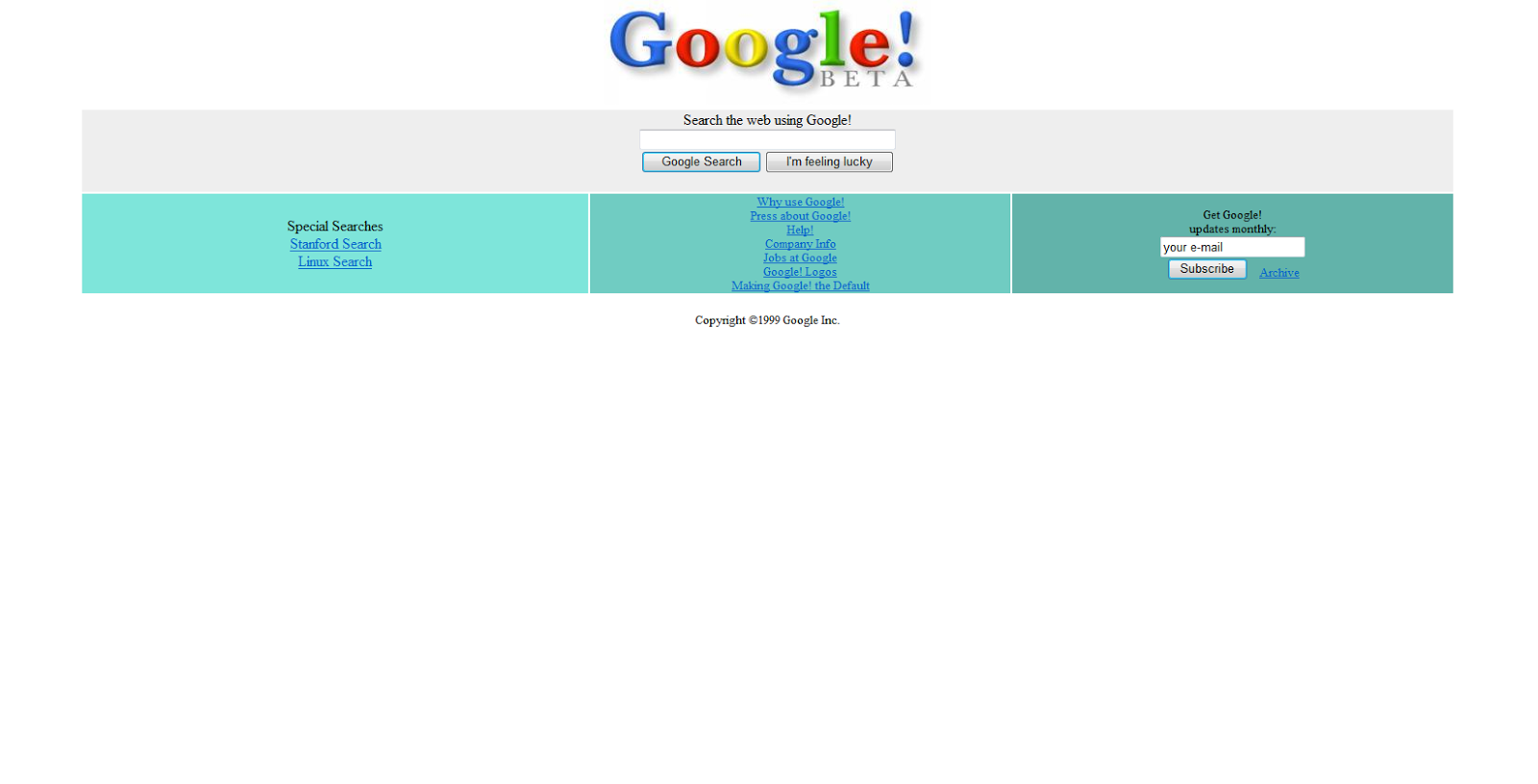
No Google didn't change the layout again they save that crap for Youtube. This is Google Beta as it appeared in the mid 90's when the site was just starting out. I want to bring this up because as we pick and critique what works and does not for sites the idea of something looking old or dated always comes up. Well what was the trend way back when websites were just getting their start? Google Beta clearly shows what websites were all about back in the day, there wasn't a lot of information and design was all about just using different colors and different colors to keep things distinguishable.
Sunday, March 17, 2013
Web -20- Maryland.gov
Welcome to Maryland.gov the home page for the government of the state of Mary- OH MY GOD WHY ARE YOU SO CLOSE TO MY FACE.
This is what you're greeted with when you enter the website for the state of Maryland. I had to zoom out to 75% just to comfortably browse the site. Everything looks like a jumbled mess and I'm not sure why because I don't remember it being like this the last time I looked at the page. The navigation is under a huge content block that doesn't warrant it's own space like that or at least not a space that large. If the picture was a bit thinner and didn't stretch across the entire page it would be more of a focal point rather than making it look like the page broke, and trust me I refreshed to make sure this wasn't some horrible browser error.
I really like the opaque header which is why I thought this was going to be a nice one to do, but the rest of the website is mangled. Do the rest of the content background as a solid color, bring in a bit more white and yellow to tie into the colors of the Maryland flag and for the love of all internet users make your website size appropriate for those who don't suffer from vision impairment.
This is what you're greeted with when you enter the website for the state of Maryland. I had to zoom out to 75% just to comfortably browse the site. Everything looks like a jumbled mess and I'm not sure why because I don't remember it being like this the last time I looked at the page. The navigation is under a huge content block that doesn't warrant it's own space like that or at least not a space that large. If the picture was a bit thinner and didn't stretch across the entire page it would be more of a focal point rather than making it look like the page broke, and trust me I refreshed to make sure this wasn't some horrible browser error.
I really like the opaque header which is why I thought this was going to be a nice one to do, but the rest of the website is mangled. Do the rest of the content background as a solid color, bring in a bit more white and yellow to tie into the colors of the Maryland flag and for the love of all internet users make your website size appropriate for those who don't suffer from vision impairment.
Web -19- Blackboard
Carroll's website style with the crazy purple header causes problems on the website that they tell instructors to use to post information for students and handle grading. This is the default look of a course's blackboard page if the instructor chooses not to add any embellishments to make it more interesting for the students. The default look is usually a sign that an instructor rarely uses blackboard to actively work with students. Now the layout of Blackboard is nice, there is a header navigation area for the overall site controls and a sidebar navigation that I don't actually hate. The sidebar navigation provides functions and links for the course itself. The site works pretty well minus some issues where links don't look like links when they're in the header, and other minor hindrances, but...
...when an instructor tries to personalize their blackboard page to be more unique to the course that they are teacher some issues arise. Here you can see the blackboard page for my web design class. My instructor has chosen a green background with the light grey and white on top for the side bar and content area. This works pretty well on it's own, and if it weren't for a grotesque purple header at the very top this would look fine on its own.
There is another issue where instructors get a bit too crazy with their choices for background and navigation button background and can turn great potential into a nightmare of random colors that look like Willy Wonka's nightmares. I think there needs to be a bit more neutrality with the colors for the overall website leaving a bit more freedom to the instructors that choose to take advantage of it.
...when an instructor tries to personalize their blackboard page to be more unique to the course that they are teacher some issues arise. Here you can see the blackboard page for my web design class. My instructor has chosen a green background with the light grey and white on top for the side bar and content area. This works pretty well on it's own, and if it weren't for a grotesque purple header at the very top this would look fine on its own.
There is another issue where instructors get a bit too crazy with their choices for background and navigation button background and can turn great potential into a nightmare of random colors that look like Willy Wonka's nightmares. I think there needs to be a bit more neutrality with the colors for the overall website leaving a bit more freedom to the instructors that choose to take advantage of it.
Web -18- Wikipedia and the wiki style
Wikipedia is a website that is loved for it's ease of information access, but despised for the ease to change information on a whim without any real sources. It's something that is unfortunately hated upon by many educators for all of the wrong reasons and is always cast in a negative fashion when really it can be used as a nice tool to get a starting point on any assignment and even link to reputable sources; however this is not the point of the blog. I want to talk about the style of Wikipedia and the imitations that every other wiki site tries to emulate over and over again.
Wikipedia is a very content heavy website that has to present itself in an according fashion. The sleek contemporary website design of the 21st century is something that doesn't translate very well to a website that is so focused to shoving text based information into your face.
As you can see the text heaviness only becomes a bigger problem once you enter a page for information on any subject. The first thing you'll notice is the bar on the far right that shows the subject of interest and a long list of facts about it that is stated with every like subject.
I cannot fairly critique Wikipedia's website design because on one hand it breaks what designers want in websites today and on the other it does its job well and has a style that's emulated by others. All it goes to show us is that not every website can fit into this sleek, modern style and that exceptions have to be made and even sometimes the best of both worlds have to be put together.
| A Mario Wiki not shying away from the Wikipedia roots. |
| Amurica Wiki! Fuck Yeah! |
I cannot fairly critique Wikipedia's website design because on one hand it breaks what designers want in websites today and on the other it does its job well and has a style that's emulated by others. All it goes to show us is that not every website can fit into this sleek, modern style and that exceptions have to be made and even sometimes the best of both worlds have to be put together.
Subscribe to:
Posts (Atom)